

Lula Cocina Mexicana
PROJECT OVERVIEW
Lula Cocina Mexicana is a 30+ year-old restaurant and mainstay in Santa Monica. With a recent change in ownership, it was time to modernize the brand's look and feel while paying homage to its DNA and cuisine. I infused a wabi-sabi feel to the logo design by embracing its quirks, while streamlining the overall user experience of the website, menu, and social media content.
DELIVERABLES
Updated Logo Design
Website Design
Menu Design and Restructure
Social Media Templates
Before: Original Logo Version 1
PHASE 1
Updated Logo Design
We launched this project by examining the various logos of the restaurant throughout the years—the new owner wanted to retain the look and feel of the existing logo but modernize it. I gathered the various forms of the logos in use across the menus, signage, and social media. I also captured images of different areas of the restaurant to create a branded color palette for us to draw from.
I researched logos and letterforms that felt both rustic and bespoke to present to the client. Ultimately the final design featured the original letterforms for the word ‘Lula,’ which were refined. The words ‘Cocina Mexicana’ were set in a typeface designed by James Coffman, an artist and pottery maker based out of Portland, whose letterforms embody a wabi-sabi feel the client desired. It’s perfectly imperfect.
Before: Original Logo Version 2
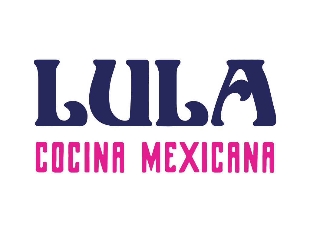
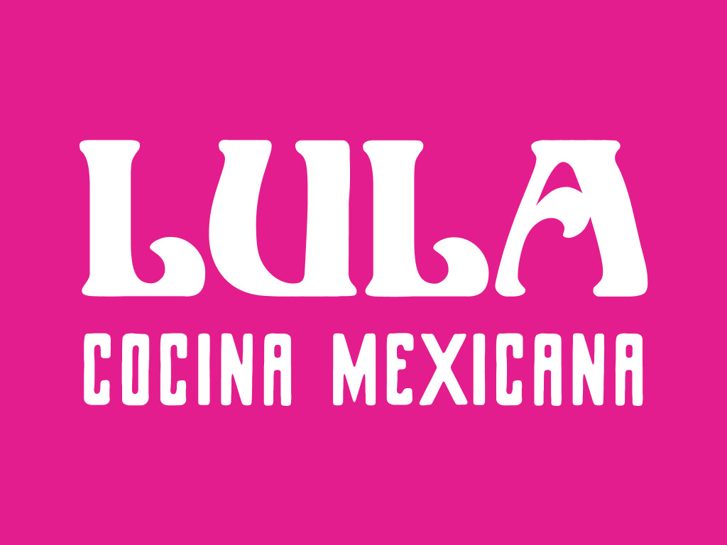
After: Modern, Redesigned Logo
PHASE 2
Website Redesign
The second phase involved creating a user-friendly website that was modern and provided existing and potential diners the information they needed when contemplating a restaurant. The former website was a landing page with scant information and challenging to navigate—we wanted to improve that drastically. We also wanted to infuse a cheeky tone of voice with copy, which is evident throughout the website.
-The Local Lore
“Voted best Mexican restaurant in Santa Monica by 17 drunk locals at 1:32 am on May 5th.”
We’re best known for our potent Lula Margarita. Whether you want to celebrate or forget the worries of the day, the Lula Margarita is right for you. It comes highly recommended by therapists, doctors, and locals.

PHASE 3
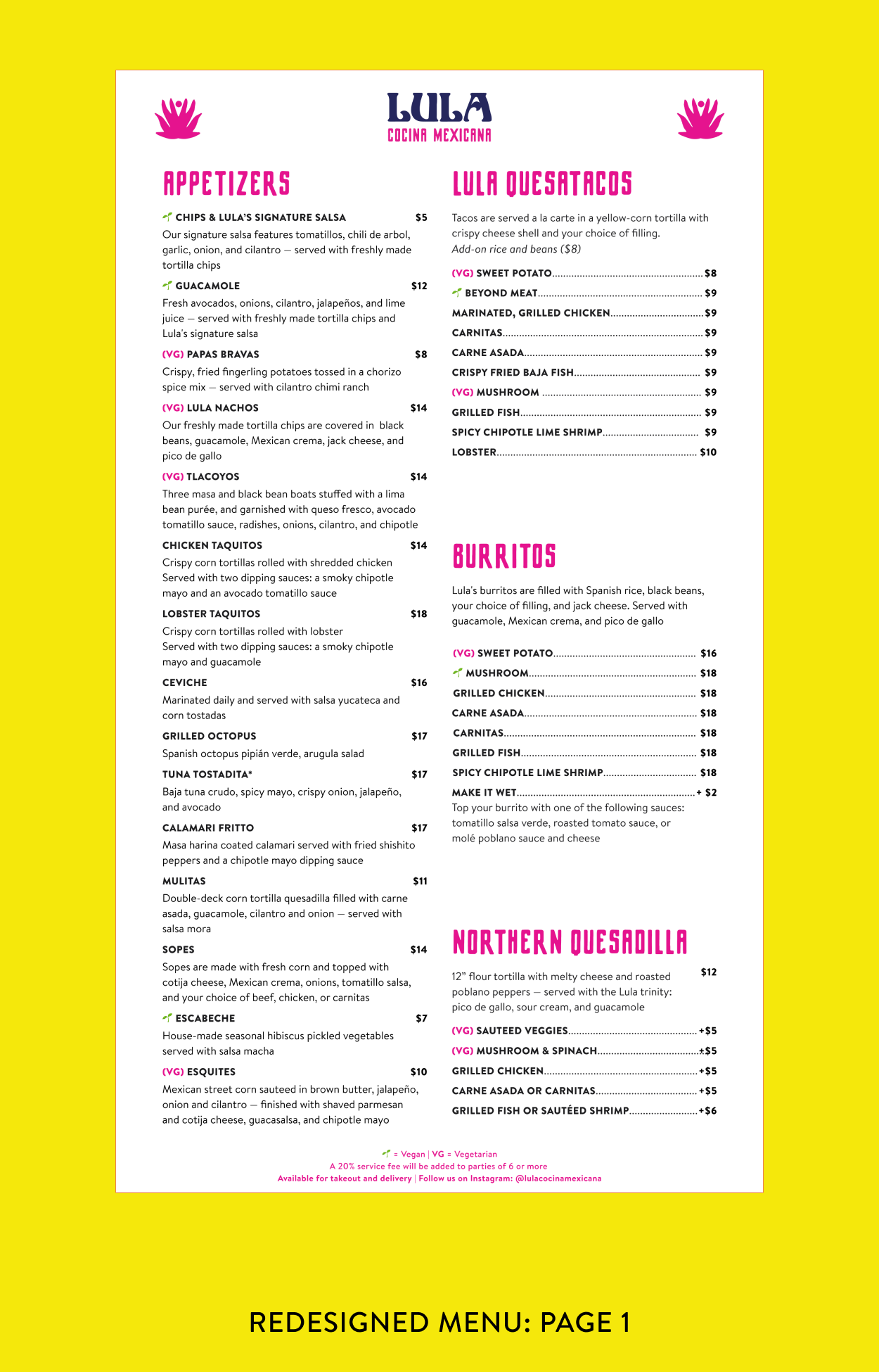
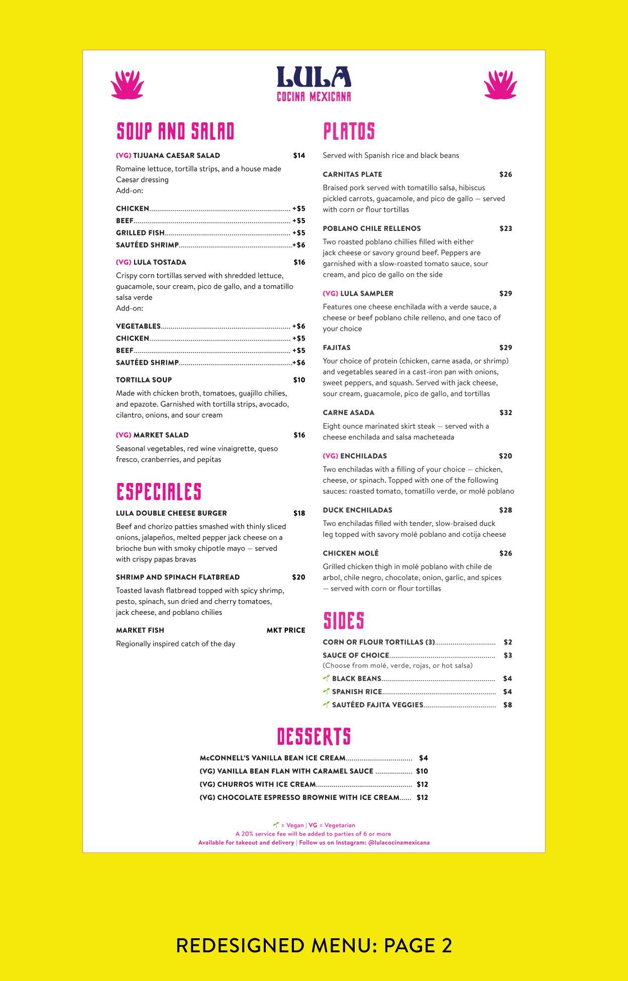
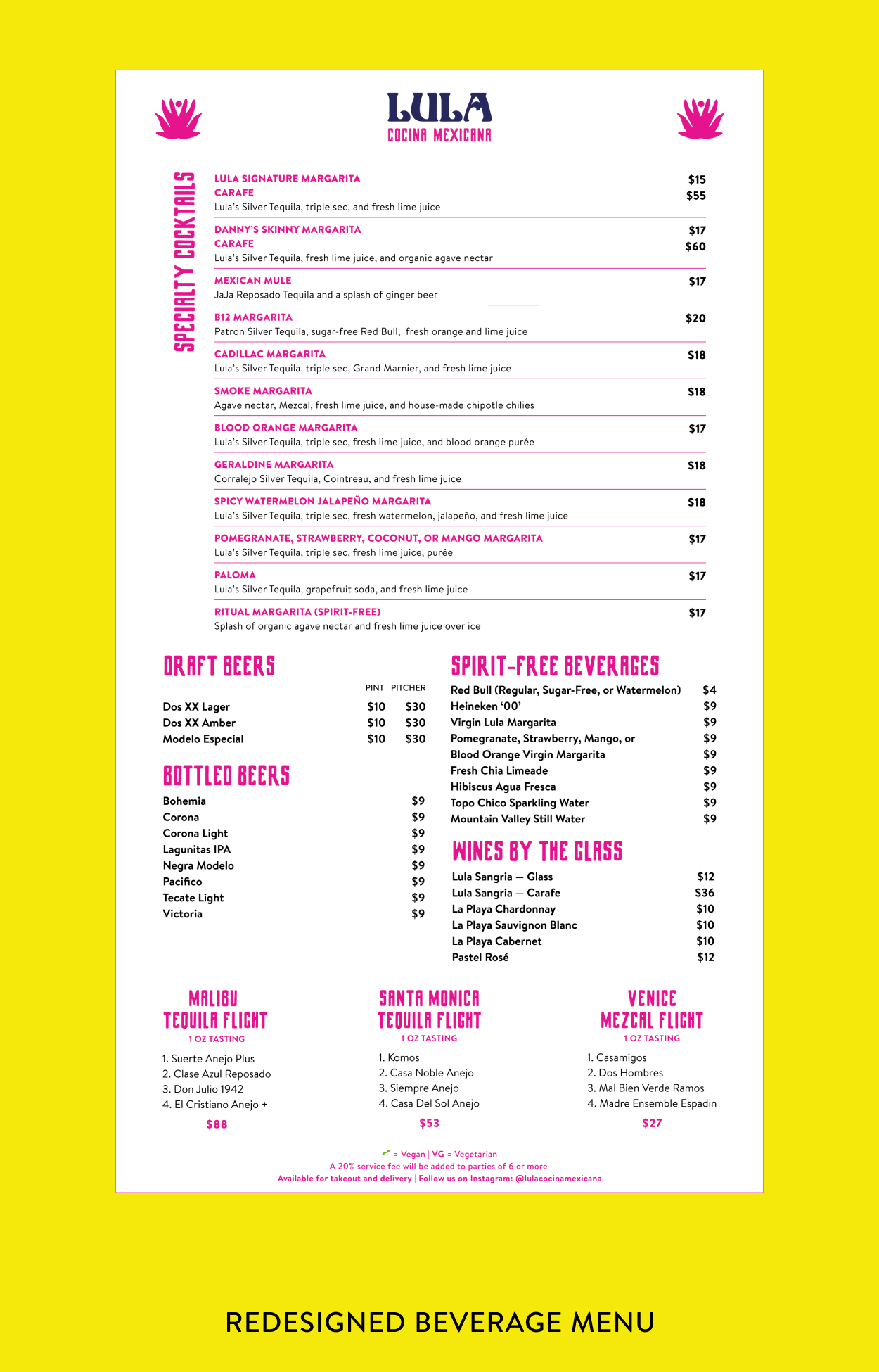
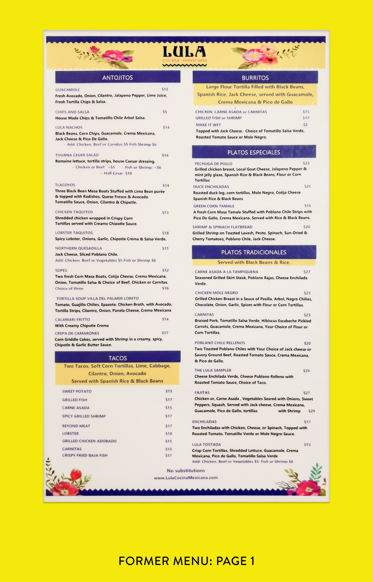
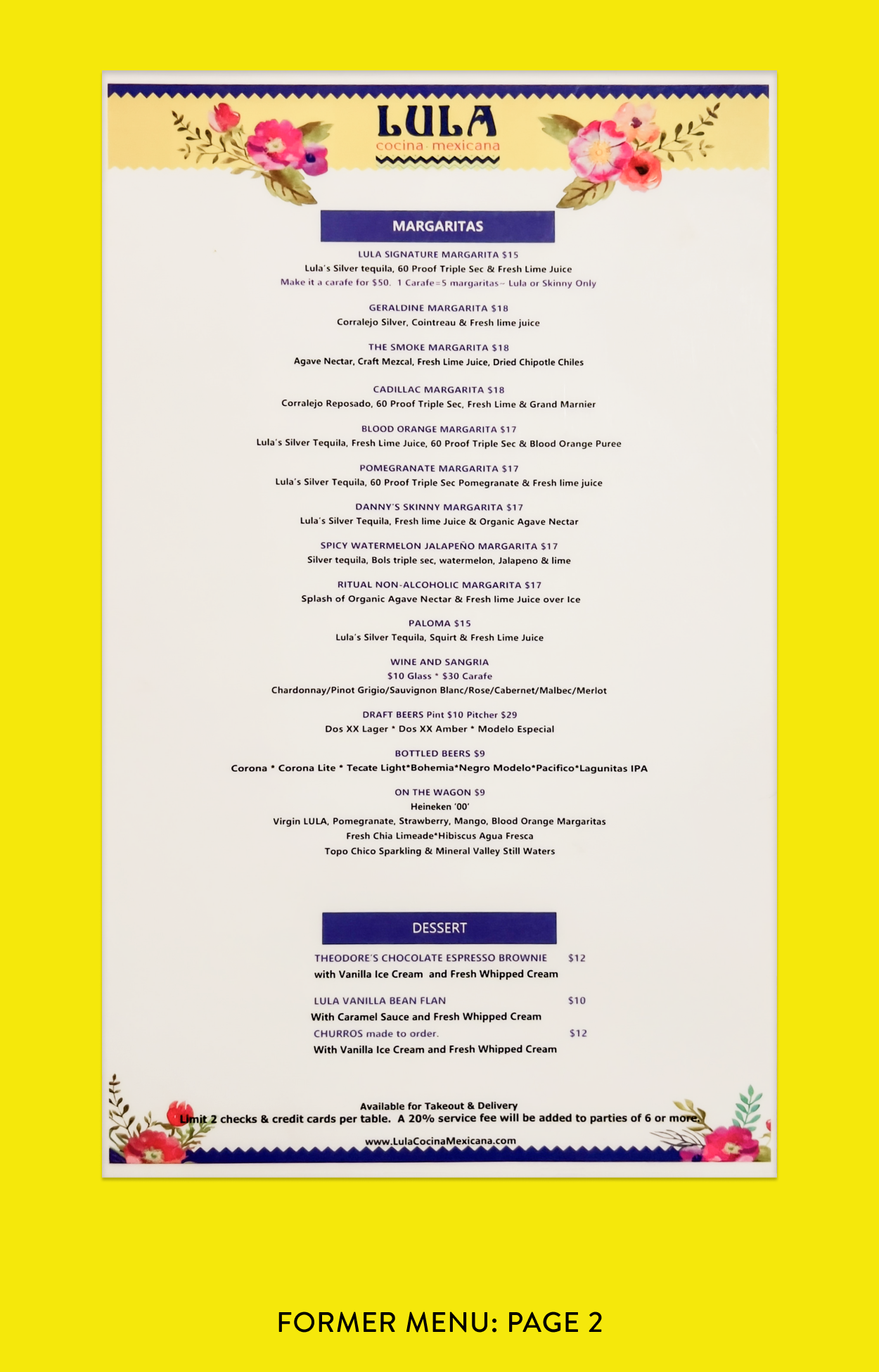
Update Menu Design
The final phase of the project was to redesign and edit the menu. The owner and I assessed the language, descriptions, and observed how diners interacting with the existing menu at the time. While there was an option to digitize the ordering process with iPads or smartphones, I advocated for a tactile experience knowing Lula’s clientele was one that appreciated and desired the feel of a menu in their hands. Diners also wanted a menu that was easy to read— the previous designs made this challenging with a lack of contrast and overall structure.
Designing menus is an exciting challenge, and my guiding principles were led by observation and inquiry. I observed Lula regulars read the menu, and surveyed them to learn what would make the experience better. Much like UX design, the layout, typefaces, and overall experience was guided by the people it would impact most. The result is a colorful experience that is pleasing to the eye and easy to read/skim with an intuitive structure.