
Aaliya: Contemporary Artist
PROJECT OVERVIEW
I worked with San Francisco-based artist, Aaliya Dadabhoy to create a brand and website for her contemporary, abstract artworks.
DELIVERABLES
Brand Guide + Assets
Content Strategy
Website Design
Phase I: Design a brand + brand guide
I launched the project with several online workshops to determine what the look and feel would be like for Aaliya’s brand. Her artworks are inspired by nature and her newest collection, Shifting Sands, feature a predominantly neutral palette. This led us to use her artworks to create a custom color palette for her brand.
I took note of her artist signature on each of her artworks, which inspired the design of both her wordmark and logomark. Aaliya’s brand logo features several diacritical marks that are used in Arabic writing to guide the reader in pronunciation. We used a modern typeface to embody a high-end, modern look and feel, since her artworks are often purchased by buyers with contemporary interiors.
Phase II: Photography
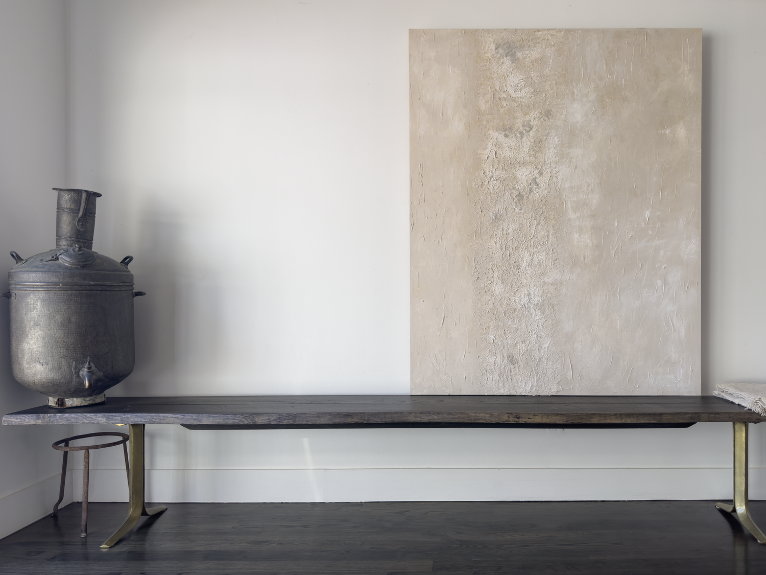
In order to create a compelling website for Aaliya, I needed to capture her work. For this process, I first captured her collection of artworks in her studio using natural lighting. Then, I used these images to upload into an AI app to place the artworks in-situ—we specifically curated interiors that reflected the homes of her collectors who live predominantly in California.

Phase III: Website Development
For the final phase of this project, we built the website using Squarespace. Each page is designed for SEO and responsive for various devices.
The photography we captured in Phase II showcased the original artwork alongside lifestyle imagery so that a potential collector can easily visualize what Aaliya’s artwork could look like in their space.
Upon launching the website, Aaliya artworks were showcased in a prestigious Napa Valley boutique where collectors had the opportunity to view and purchase her original works IRL.


